The market produces more information before your first coffee than you can read in a week. The answer isn't reading faster — it's deciding in advance what you look at, in what order, every day. That's what a dashboard is for: a fixed arrangement of live tiles that turns "what's going on?" into a two-minute scan.
Market Agent X ships with a set of built-in overviews — one per market, plus a Seasonality board — and a custom builder for when the built-ins aren't shaped like your process. Everything you build syncs to the cloud, so the workspace you set up at your desk is the same one you open on a laptop at the kitchen table.
The built-in overviews
Open Dashboards from the sidebar and the built-ins are waiting — no assembly required:
Each market overview centers on a live chart with computed levels drawn on it — the zones where price has actually reacted, not hand-drawn lines — surrounded by the flow, positioning, and structure tiles that matter for that asset class. Here's the Stocks Overview on AAPL:
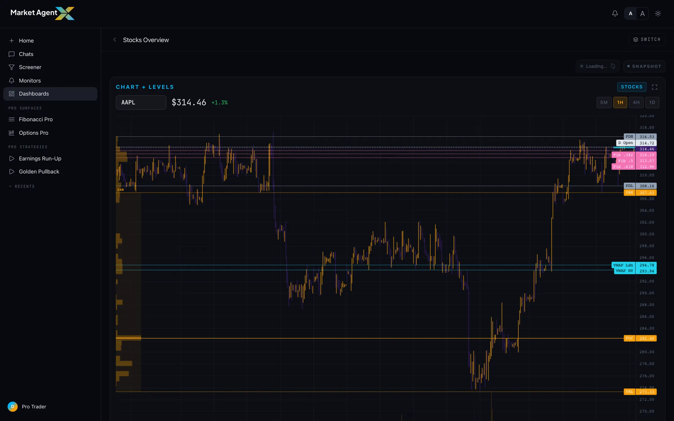
Switch to the Crypto Overview and the same discipline applies to a different market — the chart and levels stay central, but the surrounding context shifts to what moves crypto:
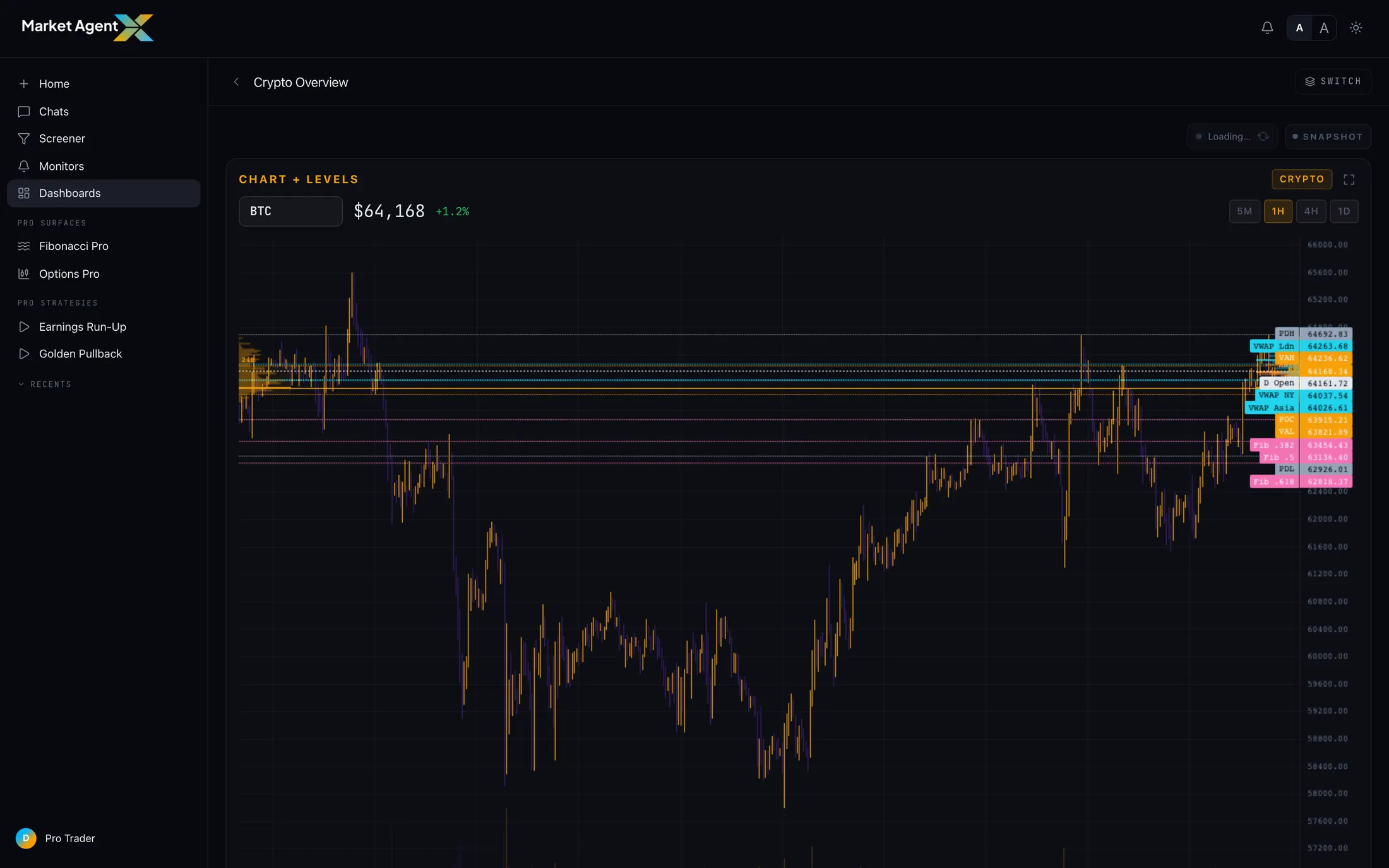
Every overview puts price and levels in the same place and arranges context the same way. Once you've learned to read one, you've learned to read all of them — which is exactly what you want when you check four markets before the open.
The Seasonality board
Alongside the market overviews sits a Seasonality dashboard — almanac tiles showing where a symbol is in its typical yearly path, its monthly statistics, and a calendar heatmap of historical returns. It's a different kind of context: not what the market is doing right now, but what this stretch of the calendar has historically looked like. (It's rich enough that we gave it its own guide — see "The Seasonality Almanac: What History Says About This Week.")
Build your own
The built-ins cover the standard reads. But maybe your process is narrower — you trade three names and you want their charts, their flow, and nothing else. That's the custom builder:
Start a new dashboard
From the Dashboards page, create a fresh board and give it a name that matches its job — "Pre-market," "Semis," "FX majors."
Add tiles from the library
Pick from a catalog of self-contained widgets — charts, levels, flow, positioning, sentiment, macro context — and they drop into the grid.
Arrange and save
Drag tiles into the order you actually read them, then save. The board joins your collection at the top of the Dashboards page.
Custom dashboards live in your account, not your browser. Build a board on your desktop and it's already there on your laptop — same tiles, same layout, no export step. Edit it anywhere and every device sees the change.
How a dashboard anchors a morning
The real value of a dashboard isn't any single tile — it's that it makes your morning repeatable. A workable routine looks like this:
Open the overview for your primary market
Two minutes. Where is price relative to the computed levels? Did anything change overnight — a level break, a shift in the flow tiles?
Glance at Seasonality
One minute. Is the calendar a tailwind or a headwind for the names you're watching this week?
Take questions to MAX
Anything that looks off becomes a chat question or a Full Analysis run. The dashboard's job is to surface the question — not to answer it.
Do that every day and you stop starting from zero each morning. The dashboard holds the standing picture; your attention goes only to what changed.
Build the view that fits your process
Six built-in boards, a full tile library, and cloud sync across your devices. Start your trial and set up your morning scan.
Start 7-Day Trial →