Some patterns in markets come from structure, not stories: earnings cycles, fiscal year-ends, index rebalances, contract rolls, holiday liquidity. They repeat because the calendar repeats. Seasonality is the study of those rhythms — what a symbol has historically done at this point in the year — and the Seasonality Almanac puts that study one click away, for any symbol, with the sample sizes printed where you can see them.
The almanac at a glance
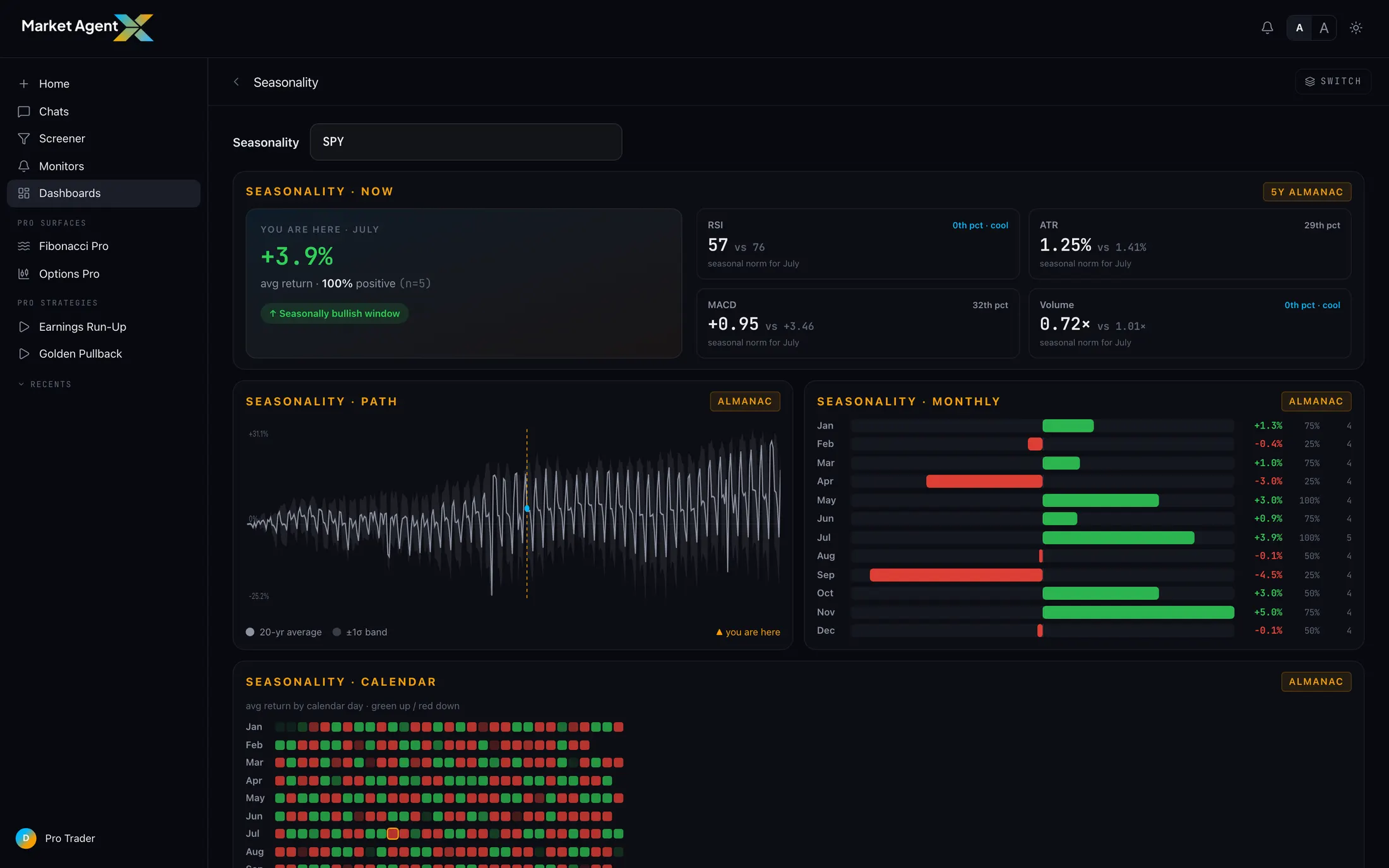
The Seasonality dashboard arranges the almanac into tiles, each answering a different question about the calendar:
The seasonal path
The centerpiece: the symbol's average trajectory through a calendar year, built from its own history, with a marker showing where today falls on that path. One glance answers the framing question — is this a stretch where the symbol has historically climbed, chopped, or faded? The shape matters more than any single point: a path that rises steadily into a window is a different backdrop than one that peaks right where you're standing.
Monthly statistics
The path shows shape; the monthly stats show the distribution behind it — how often each month closed positive and what the typical return looked like. This is where you learn whether a "strong month" was strong because it usually works or because one outlier year dragged the average. A month that's up 7 years out of 10 with modest gains is a steadier prior than one carried by a single monster year.
The calendar heatmap
The heatmap lays out every month of every year in the sample as a grid — one row per year, one cell per month, colored by return. It's the honesty layer for the whole almanac. Averages compress; the heatmap decompresses. You see each individual year that went into every stat, which years broke the pattern, and whether the "seasonal tendency" is a chorus or two loud voices.
Honest sample sizes
Here's the part most seasonality tools bury: the n. Depending on the symbol, the history behind these stats may be on the order of five years or so — and the almanac tells you rather than hiding it.
A "75% win rate" over 4 years is 3 wins in 4 tries — a coin could do that. Over 20 years it starts to mean something. The almanac shows you the sample behind every stat so you can weigh it yourself, instead of dressing a handful of observations up as a law of nature.
Small samples aren't useless — a tendency visible across five straight years is still information. They're just weak priors, and the correct response to a weak prior is light weighting, not zero weighting. The almanac's job is to make sure you know which kind you're holding.
Seasonality frames a thesis. It doesn't dictate one.
The right way to hold a seasonal stat is as a prior — the base rate you walk in with before looking at today's data. The wrong way is as a trigger.
In practice: let the almanac tell you the backdrop, then interrogate the present. A historically strong window plus supportive flow and clean structure is a thesis worth studying further — run a Full Analysis, set a monitor on the level that matters. A historically strong window with today's data leaning the other way is exactly the situation where the calendar should lose the argument. Seasonality is also one of the inputs MAX can pull mid-conversation, so you can simply ask: "what does seasonality say about this name in July?" and get the same almanac, sample sizes included.
Seasonality earns a seat at the table, never the head of it. Use it to decide what deserves your research time this week — not to decide the research's conclusion in advance.
See what the calendar says — with the n attached
Seasonal paths, monthly stats, and the heatmap behind them, for any symbol. Start your trial and pull up the almanac.
Start 7-Day Trial →